Table
Generates a simple, non-editable table based an array of objects.
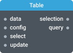
In-ports
data Array — the objects to display in the table.
select Array — the array of IDs of items to select in the table.
config JSON — the configuration object format and style the table.
Out-ports
selection Array — an array of selected items.
Overview
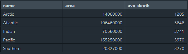
Table widget can recognize an array of objects and render in tabular format. Properties of input objects are automatically mapped to table columns, and each object will be represented with a table row. Pass the array below to the data port to create a simple table:
[
  {
    "name": "Arctic",
    "area": 14060000,
    "avg_depth": 1205
  },
  {
    "name": "Atlantic",
    "area": 106460000,
    "avg_depth": 3646
  },
  {
    "name": "Indian",
    "area": 70560000,
    "avg_depth": 3741
  },
  {
    "name": "Pacific",
    "area": 165250000,
    "avg_depth": 3970
  },
  {
    "name": "Southern",
    "area": 20327000,
    "avg_depth": 3270
  }
]
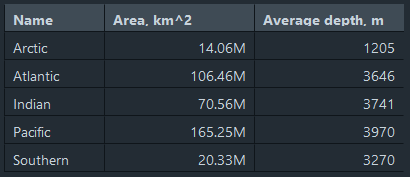
You can customize table’s appearance. In the configuration you can specify individual column properties, such as title, key, width and formatter. Pass this configuration JSON to the config port:
{
  "columns": [
    {
      "title": "Name",
      "key": "name",
      "width": 100
    },
    {
      "title": "Area, km^2",
      "key": "area",
      "formatter": "numberToHumanReadable",
      "width": 150
    },
    {
      "title": "Average depth, m",
      "key": "avg_depth",
      "width": 150
    }
  ]
}
The values in the table are non-editable. But you can sort rows and select a specific row. Click the column’s title to sort the rows. Click a row to select it — the corresponding object will be emitted on the selection port. The component to which this port is connected will work with this single object.
Settings
Title
The widget title.
Hide progress bar
Controls the visibility of widget progress bar. By default, widget progress bar is visible.