Metric Card
Displays a list of metrics with labels, change over a time period, and a sparkline chart.
In-ports
data Array — input array with one or several more metric objects.
config JSON — configuration parameters.
Out-ports
on-click Boolean — emits true when user clicks on the card. The event is emitted only when the widget is in interactive mode.
Overview
Metric Card lets users quickly view metrics and interpret their values.
Metrics’ labels and their values are always available at glance, plus one metric can be set as primary and display trend over a time period and a sparkline chart. The primary metric can be switched at runtime to call attention to what is most important at the moment.
Metric is defined with an array with an object containing metric properties. Several metrics can be defined with several such objects. To display metrics, pass that array to the data port. To edit widget’s configuration at runtime use the config port.
Examples
Single metric
To display just one metric pass its name and value. This metric is, by default, your primary metric.

[
    {
        "name": "Tesla Inc",
        "value": 1516.8
    }
]
List of metrics
To add secondary metrics, add objects defining them.
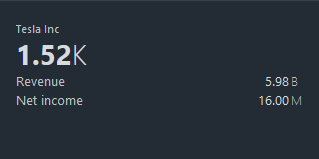
[
    {
        "name": "Tesla Inc",
        "value": 1516.8
    },
    {
        "name": "Revenue",
        "value": 5980000000
    },
    {
        "name": "Net income",
        "value": 16000000
    }
]
Change over a time period
Make the primary metric indicate an increasing or decreasing trend with an up or down arrow respectively. Add one of the following properties to the primary metric object:
changeValue— specifies the difference between the final and initial value.changeValuePercent— specifies the percentage change between the final and initial value.
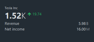
[
    {
        "name": "Tesla Inc",
        "value": 1516.8,
        "changeValue": 19.74
    },
    {
        "name": "Revenue",
        "value": 5980000000
    },
    {
        "name": "Net income",
        "value": 16000000
    }
]
Sparkline chart
You can display a trend with a sparkline chart. Add the history property specifying an array of historical values to the primary metric object.
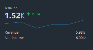
[
  {
    "name": "Tesla Inc",
    "value": 1516.8,
    "changeValue": 19.74,
    "history": [1510, 1512, 1504, 1509, 1509, 1515]
  },
  {
    "name": "Revenue",
    "value": 5980000000
  },
  {
    "name": "Net income",
    "value": 16000000
  }
]
If changeValue is not specified, the change will be calculated based on the last historical value.
Tooltip templates
Tooltips appear when you hover mouse over the primary metric or a sparkline chart. Use the Advanced tab to customize tooltip templates.
The default primary metric tooltip’s template is defined as follows:
{
    "tooltipTemplates": {
        "primary": "<b>{{metricName}}:</b> {{metricValue}}<br><b>Change:</b> {{changeValue}} ({{changePercent}})<br><b>Period:</b> {{historyDuration}} {{historyUnit}}"
    }
}
The default sparkline chart’s tooltip is defined similarly:
{
    "tooltipTemplates": {
        "secondary": "{{metricName}} history over {{historyDuration}} {{historyUnit}} period"
    }
}
Note the use of placeholders of the form {{property}} in this example. Placeholders refer to metric properties to display them in the tooltip. A placeholder can use the following properties:
metricNamemetricValuechangeValuechangePercenthistoryDurationhistoryUnitaccessor
Tooltip formatting options include <br> for new line, and <b> for bold text.
Tooltip content accessors
To generate a tooltip based on a property, state it explicitly in the tooltipContentAccessors object. The following value types are supported: String, Number, Array, Object.
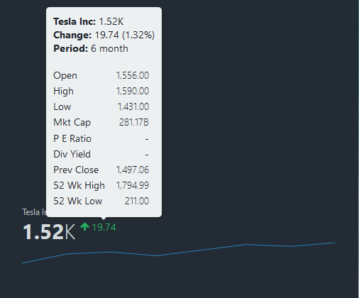
Consider the following primary metric example:
[
    {
        "name": "Tesla Inc",
        "converter": "numberToHumanReadable",
        "value": 1516.8,
        "changeValue": 19.74,
        "history": [0, 10, 12, 8, 14, 20, 18, 22],
        "historyMeta": {
            "duration": 6,
            "unit": "month"
        },
        "summary": {
            "Open": "1,556.00",
            "High": "1,590.00",
            "Low": "1,431.00",
            "Mkt cap": "281.17B",
            "P/E ratio": "-",
            "Div yield": "-",
            "Prev close": "1,497.06",
            "52-wk high": "1,794.99",
            "52-wk low": "211.00"
        }
    }
]
To generate the primary metric’s tooltip based on its summary property, on the Advanced tab, enter the following configuration:
{
    "tooltipContentAccessors": {
        "primary": "summary",
				"secondary" : null
    }
}
Hover the mouse over the metric’s label to view the tooltip:
Metric properties
| Property | Description |
|---|---|
name | The name of the metric. |
value | The value of the metric. |
converter | Formatting function. See Value Formatters to learn how to format the values of different data types. Default value is numberToHumanReadable. |
unit | Custom unit of measurement for metric. converter has higher priority. |
changeValue | The difference between the final and initial value. |
changeValuePercent | The percentage change between the final and initial value. Has a higher priority than changeValue` if both properties are set. |
history | An array of numbers representing historical values of the metric. Defines the points for the sparkline chart. Also displays the difference between the last historical value and current value. |
historyMeta | Additional meta data for the sparkline chart history: {"duration": 6, "unit": "months"}. These properties can only be shown in the tooltip. |
Settings
Title
Sets a widget's title.
Hide progress bar
Controls the visibility of the progress bar. By default, the progress bar is visible.
Is interactive
Controls whether the widget is clickable. When enabled, the on-click port emits true on click.
Primary metric index
Index of the metric you want to highlight. This index corresponds to the index of the object that defines this metric. The indexing starts from 0. The default value is 0.
Primary metric can be switched at runtime. Use the primaryMetricIndex property to set the index through the config port.
Make this field blank to disable primary metric.
Error messages settings
Specifies custom error messages to display inside the widget. You can set a message for each error code.