Message Input
Enabling users to input and submit short text messages, attachments, and options in chat and similar applications.
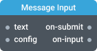
In-ports
data String | Object — Accepts either a plain text String or an Object with the following structure:
text(String): The message text (plain or Markdown, depending on formatting settings).attachments(Array): List of attachment objects (see Attachments section).options(Array): List of selected option names (strings).
config JSON (dynamic) — Accepts a JSON object with configuration properties that can be set at runtime.
Out-ports
submit Object — Emits an object { text, attachments, options } when the Submit button is clicked or the Enter key is pressed.
text(String): The submitted message text.attachments(Array): List of submitted attachments.options(Array): List of selected option names.
Overview
The Message Input widget is a UI component designed for chat and other applications that require short form text input, attachments, and selectable options.
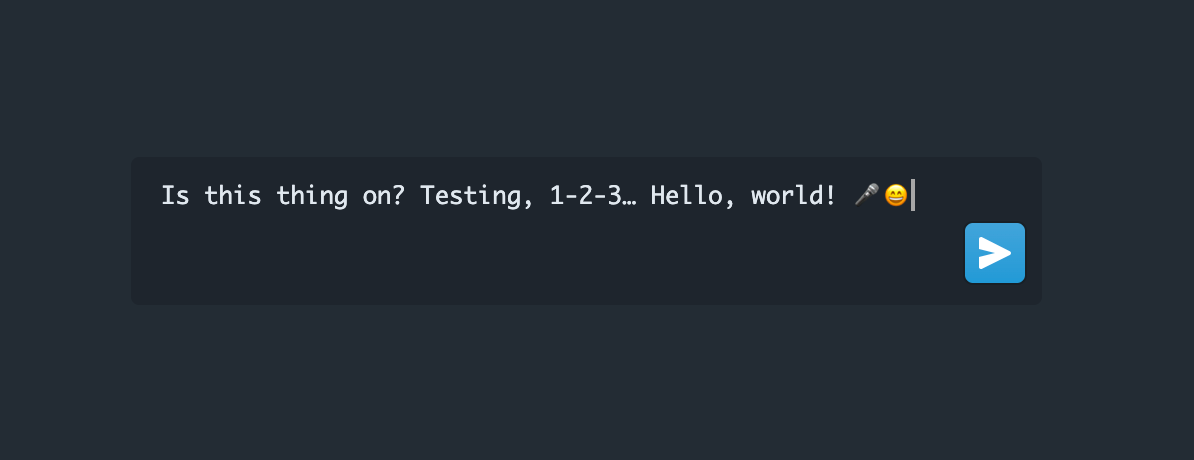
Users can submit messages by either clicking on a submit icon button or pressing the Enter key (default). You can change the key combination for submitting messages by switching the "Submit on enter" setting.
This widget supports dynamic configuration, allowing you to specify required settings either in the Settings dialog or at runtime through a configuration object sent to the config port. To enable the config port for runtime configuration, activate the Enable realtime config port setting.
Data Port Usage
The data port supports two input types:
- String: Simple usage for plain or Markdown text input.
- Object: For advanced usage, send an object with the following structure:
{
  "text": "Hello world!",
  "attachments": [
    { "id": "file-1", "file": { /* File object */ } }
  ],
  "options": ["urgent", "private"]
}
attachmentsis an array of objects with at leastidandfileproperties.optionsis an array of option names (strings) matching those defined in the configuration.
Settings
Enable realtime config port
If this setting is enabled, the component can be configured through the config port. This port accepts a configuration object as input and allows you to set dynamic properties at runtime. Note that using this port does not cause the component to reinitialize, but it may cause some previous state of the component to be lost.
Formatting (formatting)
The following properties are grouped under the formatting object:
-
Format message with Markdown (
formatAsMarkdown)Specify whether the user input should be formatted with Markdown or as plain text.
Type:
Boolean
Default:true -
Font size (
fontSize)Specify the font size of the text input area within the widget. The font size can be set to any value in pixels.
Type:
Number
Default:12 -
Placeholder text (
placeholderText)Placeholder text when there is no value.
Type:
String
Example:
"formatting": {
  "formatAsMarkdown": true,
  "fontSize": 12,
  "placeholderText": "Enter your message here"
}
Options Menu (optionsMenu)
Configure a custom menu of selectable options for the user. Each option can have an icon, a title, and a name. The selected options will be included as extra parameters in the message data.
- list: Array of option objects. Each object should have:
name(String, required): Unique identifier for the option (sent with the data event).icon(String, optional): Icon name to display (default:shapes).title(String, optional): Label for the option (default:Option).
- allowMultipleSelection (
Boolean): Allow users to select multiple options at once. Default:false.
Example:
"optionsMenu": {
  "list": [
    { "name": "urgent", "icon": "warning-sign", "title": "Urgent" },
    { "name": "private", "icon": "lock", "title": "Private" }
  ],
  "allowMultipleSelection": true
}
Attachments (attachments)
- allowedFileTypes (
String): Comma-separated list of allowed file types (default:image/*,application/pdf). - allowPasteImages (
Boolean): Allow users to paste images from the clipboard (default:true).
Submit button properties (submitButton)
- Minimal (
minimal) - Whether this button should use minimal styles. Default:false. - Large (
large) - Whether this button should use large styles. Default:false. - Rounded (
rounded) - Whether this button should use rounded styles. Default:false. - Intent (
intent) - Visual intent color to apply to the button.- Values:
none(grey),primary(default, blue),success(green),warning(orange), anddanger(red). - Default:
primary
- Values:
Submit on enter (submitOnEnter)
Change the key combination for submitting messages and adding new lines.
Default: true
Audio Input (audioInput)
Configure audio input options for the widget:
- enabled (
Boolean): Enable or disable microphone input. Default:true. - mode (
String): Audio input mode. Can bespeech-to-text(transcribe audio to text) orrecord-audio(attach the audio recording as a file). Default:speech-to-text. - language (
String): (Only forspeech-to-textmode) Specify the transcription language using an ISO language code, e.g.,en-US. Default:en-US.
Example:
"audioInput": {
  "enabled": true,
  "mode": "speech-to-text",
  "language": "en-US"
}
Configuration Object
Here is an example of a runtime configuration object that you can use as a template:
{
  "formatting": {
    "formatAsMarkdown": true,
    "fontSize": 12,
    "placeholderText": "Enter your message here"
  },
  "attachments": {
    "allowedFileTypes": "image/*,application/pdf",
    "allowPasteImages": true
  },
  "optionsMenu": {
    "list": [
      { "name": "urgent", "icon": "warning-sign", "title": "Urgent" },
      { "name": "private", "icon": "lock", "title": "Private" }
    ],
    "allowMultipleSelection": true
  },
  "submitButton": {
    "minimal": false,
    "large": false,
    "rounded": false,
    "intent": "primary"
  },
  "audioInput": {
    "enabled": true,
    "mode": "speech-to-text",
    "language": "en-US"
  }
}