List
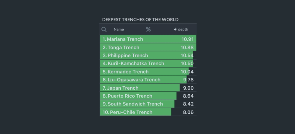
List widget displays a list of items with one or many numeric properties. Numeric values are overlaid over the item names as colored bars, effectively creating a nice scrollable bar chart.
In-ports
select Array - an array of item IDs to be selected (highlighted) in the list.
data QData - queryable data port for passing input data. Compatible with List Adapter and Crossfilter Dimension components.
Out-ports
selection Array - emits an array of IDs of the selected items.
Overview
List widget can be used to display a simple list of items or a numbered list of items with overlaid bars. Its useful for displaying top-n lists or leaderboards.
To prepare input data for List widget use List Adapter or Crossfilter Dimension components.
Settings
Title
The widget title.
Bar color (positive)
The color of positive bars (use Hex code e.g. #27AE60)
Bar color (negative)
The color of negative bars (use Hex code e.g. #C0392B)
Max number of items per page
List widget will only load and render items up to this limit. If the number of items in the dataset is more than this limit the next page of items will be automatically loaded when user scrolls to the bottom of the list.
Value converter
Specify the converter for numeric values. See Value Formatters to learn how to format values of different types.
Enable multi-select
If turned on, will allow user to select multiple items in the list. Use Command + Click (Ctrl + Click on PC) to select multiple individual items, or Shift + Click to select a range. By default multi-select is disabled.
Require selection
At least one item in the list must be selected. When List widget is initialized the top most item in the list is automatically selected and emits an event on selection port.
Show numbered list
If turned on, will display the sequence number next to each item in the list.
Show absolute and % values
For each numeric value widget calculates relative % values. If this setting is turned on, both absolute and relative % value will be displayed.
Name column header
Set custom header for the name column. By default "Name" header is used.
Name field key
Key in the input dataset that will be used for items Name.
ID field key
Key in the input dataset that will be used for items ID.
Select aggregations
By default widget will display all aggregations provided in the input data. Use + button to specify one or more aggregations that you want to display. All the remaining aggregations will be omitted.
Show in Datascope
If turned on, the widget will be added to Datascope panel.
Hide progress bar
Controls the visibility of widget progress bar (visible by default).
Hide help icon
Controls the visibility of help icon (visible by default).