Form
Generates dynamic HTML forms from JSON schemas with customizable styling and validation.
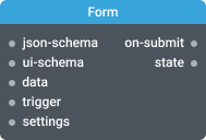
In-ports
json-schema Object — JSON schema defining form fields and their properties.
ui-schema Object — UI schema for customizing form appearance and behavior.
data Object — Data to populate form fields.
trigger <any> — Triggers the state port to emit current widget state.
settings Object — Configuration object for dynamic runtime settings updates.
Out-ports
on-submit Object — Form data when Submit button is clicked.
state Object — Current form state and latest action details when form changes.
Overview
The Form widget automatically generates HTML forms from JSON schemas using the react-jsonschema-form library. It supports text inputs, checkboxes, radio buttons, select menus, and complex nested structures.
Quick Start:
- Pass a JSON schema to the json-schema port to define form fields
- Optionally pass a UI schema to the ui-schema port for styling
- Connect the on-submit port to capture form data
Key Features:
- Automatic field generation from JSON schema
- Built-in validation with custom error messages
- Real-time form state tracking via state port
- Pre-populate fields using the data port
- Customizable styling and layout with UI schema
Form Submission:
- Click Submit button or press Enter to emit data
- Reset form by passing empty object
{}to data port - Track changes in real-time through state port
Example: Login Form
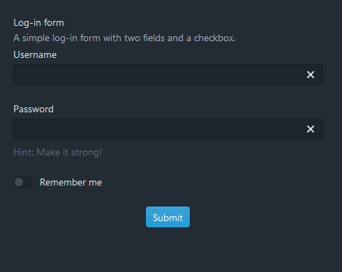
JSON Schema:
{
  "title": "Log-in form",
  "description": "A simple log-in form with two fields and a checkbox.",
  "type": "object",
  "properties": {
    "username": {
      "title": "Username",
      "type": "string"
    },
    "password": {
      "title": "Password",
      "type": "string"
    },
    "checkbox": {
      "title": "Remember me",
      "type": "boolean",
      "enum": [true, false]
    }
  }
}
UI Schema:
{
  "username": {
    "ui:autofocus": true,
    "ui:emptyValue": ""
  },
  "password": {
    "ui:widget": "password",
    "ui:help": "Hint: Make it strong!"
  }
}
This creates a form with username (auto-focused), password (masked input), and a "Remember me" checkbox.
Settings
Validate as you type (enableLiveValidation)
Enables validation on form changes. By default, validation occurs only on submission.
- Required: No
Show button (visible)
Controls Submit button visibility.
- Required: No
- Default:
true
Label (text)
Custom text for the Submit button.
- Required: No
Align button (align)
Submit button alignment.
- Required: No
- Values:
center,left,right,fill - Default:
center
Intent (intent)
Submit button color theme.
- Required: No
- Values:
none,primary,warning,success,danger - Default:
none
Related
For complete examples and interactive demos, visit the react-jsonschema-form playground.