Calendar
Displays calendar and lets the user select a date.
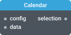
In-ports
config JSON — widget configuration parameters.
data Array — date to select.
Out-ports
selection Array — emits a selected date formatted as “YYYY-MM-DD”.
Overview
Calendar widget is used to display and select dates in your app. It displays a current month view that users can flip to another month or year. You can restrict which dates are selectable and select the date through the data port.
Select a date
Pass an array with a date to the data port. Passing the following array selects August 1, 2022.
[
  "2022-08-01"
]
Selected date will be emitted on the selection port as an array containing a date.
Restrict which dates can be selected
Pass a configuration to the config port to specify an interval or even certain dates that can be selected. The configuration can include any of the following properties:
| Property | Description |
|---|---|
minDate | Start date of the selectable interval. |
maxDate | End date of the selectable interval. |
includeDates | An array of dates to make selectable. When used together with minDate, maxDate, the resulting dates will are an intersection of these sets. |
excludeDates | An array of dates to exclude. |
clearable | If set to true, the date in the calendar can be unselected which is indicated by emitting an empty array on the selection port. |
Settings
Title
Widget’s title.
Hide progress bar
Controls the visibility of the progress bar. By default, the progress bar is visible.
Error messages settings
Specify custom error messages to display inside the widget. You can set a message for each error code.