Button
Renders a clickable button that emits events when clicked or triggered.
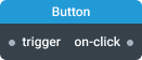
In-ports
trigger <any> — triggers the button to emit its click event.
config JSON (dynamic) — accepts a JSON object with configuration properties that can be set at runtime.
Out-ports
on-click <any> — emits the trigger data or true when button is clicked.
Overview
The Button widget displays a clickable button element. When clicked by the user or triggered via the trigger port, it emits data on the on-click port. The button supports various visual states and styling options including icons, different sizes, and intent colors.
Configuration
This component supports dynamic configuration. You can specify the required settings either in the Settings dialog or through a configuration object. To enable the config port for runtime configuration, turn on the Enable realtime config port setting.
Settings
Enable realtime config port
When enabled, this setting allows the component to be configured via the config port. The port accepts a configuration object as input, enabling dynamic property updates during runtime. While using this port won't trigger component reinitialization, it may result in the loss of some previous component state.
Text (text)
Button text content.
- Required: No
- Default:
button
Icon Only (iconOnly)
Display only an icon without text.
- Required: No
- Default:
false
Left Icon (icon)
Name of a UI icon to render before the text.
- Required: No
Right Icon (rightIcon)
Name of a UI icon to render after the text.
- Required: No
Intent (intent)
Visual intent color to apply to element.
- Required: No
- Values:
none,primary,success,warning,danger - Default:
none
Text Alignment (alignText)
Text alignment within button. Controls how text and icons are positioned.
- Required: No
- Values:
left,center,right - Default:
center
Size (size)
Button size variant.
- Required: No
- Values:
small,regular,large - Default:
regular
State
Disabled (disabled)
Makes this button non-interactive. It will not emit events on click or on trigger.
- Required: No
- Default:
false
Minimal (minimal)
Whether this button should use minimal styles.
- Required: No
- Default:
false
Active (active)
If set to true, the button will display in an active state.
- Required: No
- Default:
false
Outlined (outlined)
Whether this button should use outlined styles.
- Required: No
- Default:
false
Loading (loading)
If set to true, the button will display a centered loading spinner instead of its contents, and the button will be disabled.
- Required: No
- Default:
false