Navigating the Kelp interface
In this topic, you'll learn your way around the Kelp interface. You'll get the necessary hands-on skills to build your apps.
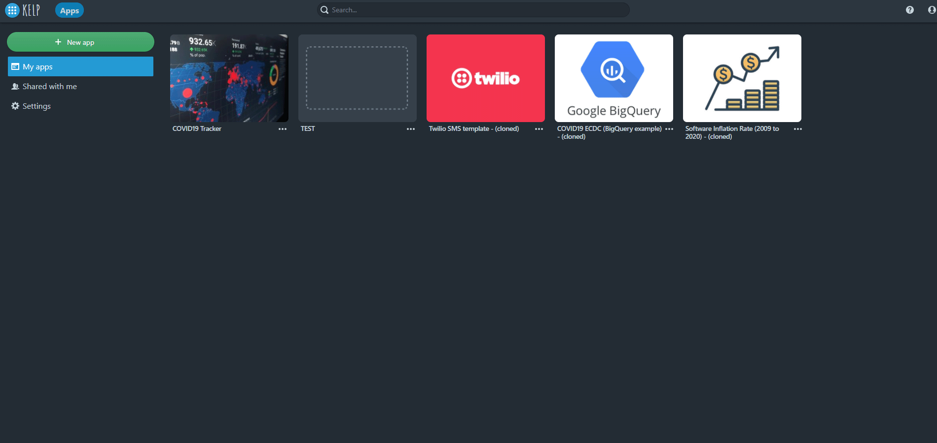
Viewing your apps
You've logged in to Kelp. What's next?
-
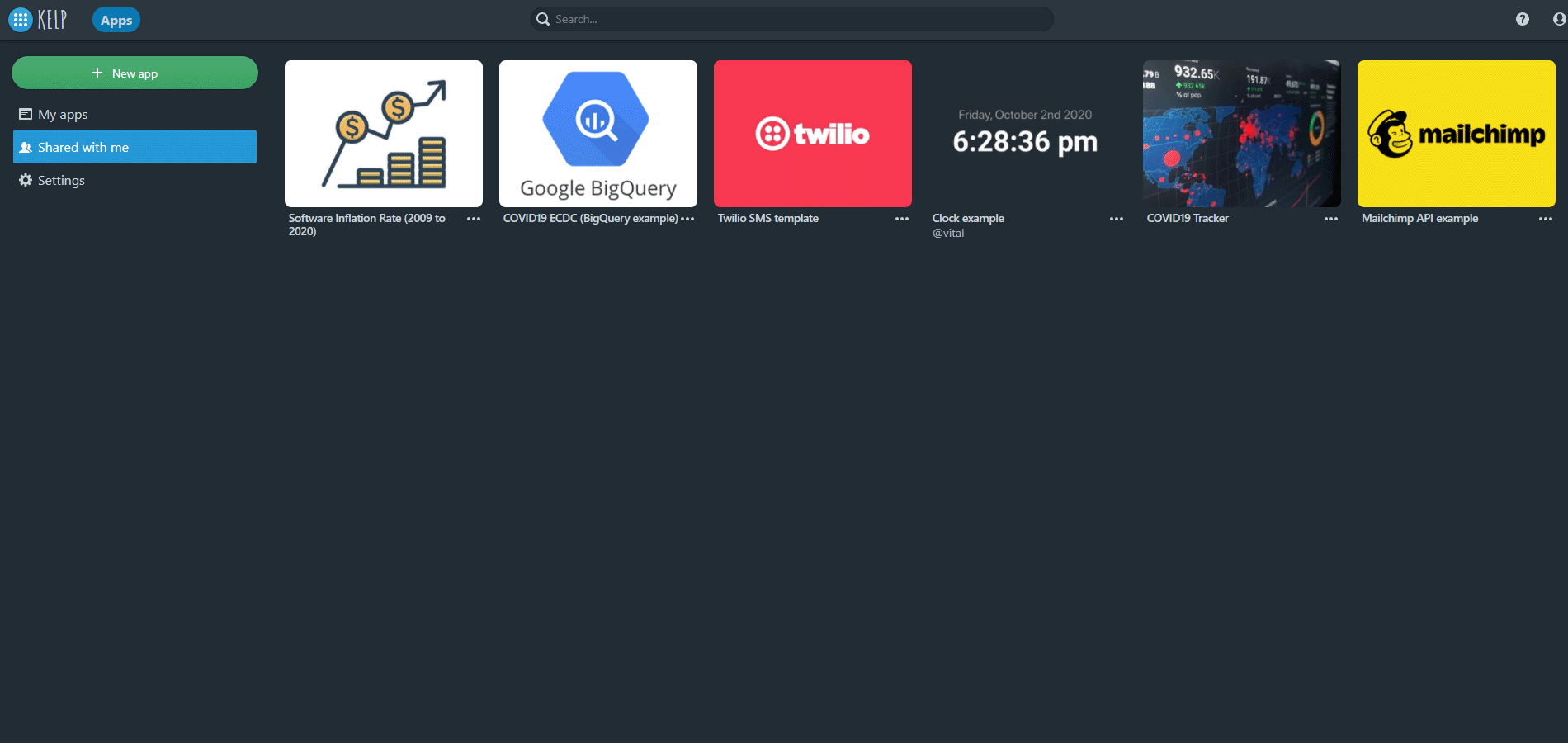
My apps is your personal workspace and starting point. It shows all apps you've created as cards.
My apps must be empty now because you don't have apps yet. But if you had, you could easily navigate between them: the app cards would show you the app names and thumbnails.
-
Shared with me shows apps other Kelp users shared with you. If you share an app with other users, they will see it in their Shared with me collection.
Go to Shared with me and have a look. To help you dive into Kelp faster, we've already shared some apps with you. Use them as you see fit: make their copies, change the copies, use them as a reference material for new apps, and so on.
Note: When Kelp users share apps with you, they can grant you full or read-only access. You can't change a read-only app but you can copy it to your My apps collection and change the copy.
-
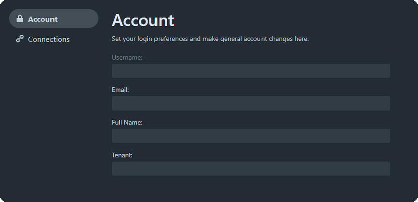
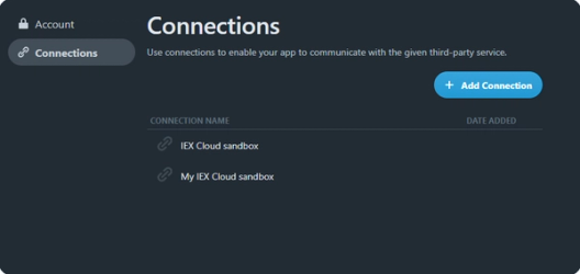
Settings. In Settings, you can see your account settings and configure connections to secure data sources (APIs, databases, and so on).
Creating an app
In the top left corner of the screen, click the blue button and return to the landing page we've started with.
To create an app:
- In the top left corner of the screen, click New app.
- Give your application a recognizable name (for example, "My First App") and, if you want, a description.
- Click Create.
You've created your first app. You automatically go to the app Developer mode.
Note: Kelp opens all new apps in Developer mode. You can switch to other modes using the Dev Toolbar on the right.
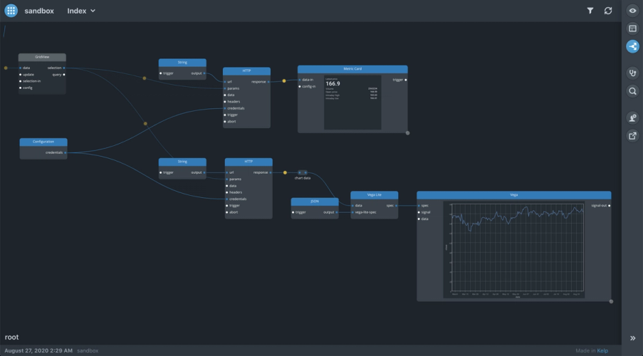
Navigating the canvas
You're in Developer mode. You see the blank black canvas and, in the top left corner of the screen, your application name.
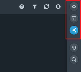
In the top right corner of the screen, you see the Dev Toolbar.
Make your canvas comfortable to work with:
-
Pan and zoom. To do so, use the touchpad, the scroll wheel (the
Ctrl+scroll wheelshortcut), or the mouse drag. -
Restore the default zoom level. Use the
Shift+1hotkey.Note: To see all hotkeys available in Kelp, use the
Shift+?hotkey.
All actions in the Kelp interface are intuitive.
Placing components
The canvas is the working space where you build the app logic by placing components and wires.
Components are similar to building blocks. They help you build apps without traditional coding. Components provide ready-to-use functional pieces for your app logic, for example, making API calls, creating forms, processing data, and so on.
To place a component:
- Right click anywhere on the canvas. This will open the component library: the list of all available Kelp components.
- Locate the component in the library. To do so, type a component name in the search bar (for example, "http") or browse the left menu.
- Once you've selected the component, click Place component.
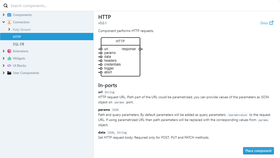
You've placed the HTTP component. Let's repeat the steps above and place two more components: *String** and *Table*.
Working with components
You can move and arrange components on the canvas the way you want. Try this with the HTTP component. Click on it, hold, drag, and drop anywhere you like.
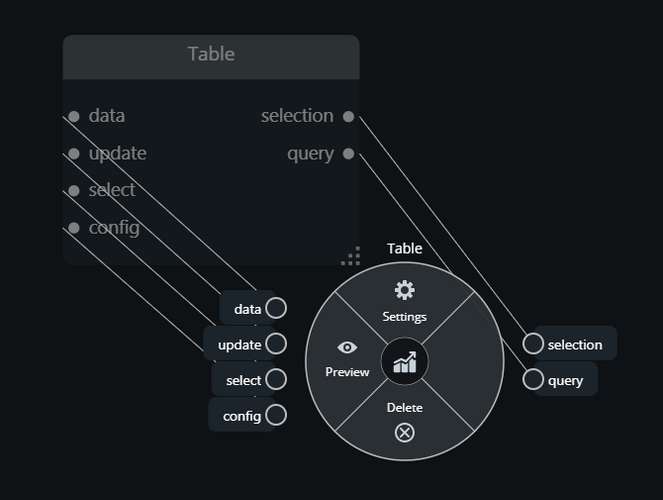
Each component has its context menu, which shows the most important actions you can do with the component. To see the context menu, right click on a component.
You can also do the following with components:
-
Select. To do so, left click on the component you want to select. Kelp highlights the selected component in yellow.
-
See the Settings dialog. You have two ways to do so: select the component and press the space bar or open the context menu and click Settings.
-
Rename. To rename a component, double right click on the component name, type a new name, and press
Enter. The renamed component will have a custom name and the component type displayed.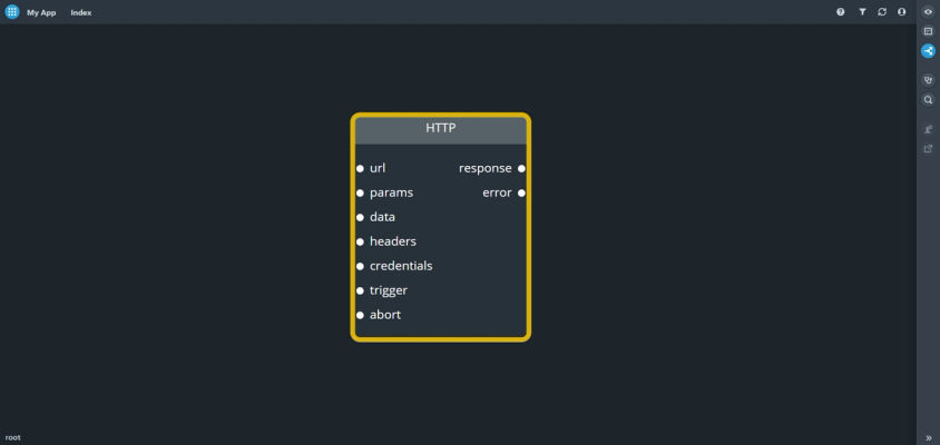
Working with widgets
The component library keeps components in different categories. For example, Table is the widget component or a widget for short. Widgets are visual components that display information to users. Like other component types, you place widgets in Developer mode but you arrange and format them later in Design mode.
You work with widgets the same way as you do with other components. However, widgets have the preview feature specific to them only.
Previewing a widget helps you to see what a widget shows. You have two ways to preview a widget:
-
Drag the right bottom corner of the widget and expand it until the widget header becomes blue.
-
Open the widget context menu and click Preview.
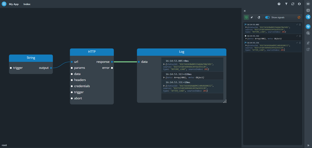
Connecting components with wires
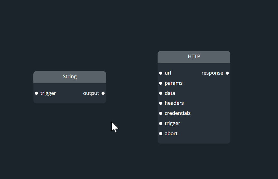
You have several components on the canvas. Let's have the String and HTTP components interact with each other by connecting them with a wire.
Components have in- and out-ports.
Click on the output port of the String component. Then hold, drag, and drop the white thin line on the url in-port of the HTTP component. It's easier to do than to explain.
Tip: You can connect any in- or out-port to multiple wires.
You can select, reconnect, and disconnect wires.
To select a wire, left click on it. Kelp highlights the selected wire in yellow.
To reconnect a wire, select it, drag its end, and drop it on another port of the same or another component.
Disconnecting a wire means deleting it from the canvas. You can disconnect a wire in two ways:
- Select the wire and press
Delete. - Select the wire, drag its end, and drop it not on another port but anywhere on canvas.
Working with wires
Wires have an action specific to them only, which is called "data transformation".
To apply a data transformation to the wire, click on the wire, press the space bar, select the JSON transformation language, and then click Done. Kelp marks a wire that has a data transformation applied with a yellow bullet.
Read more about data transformations.
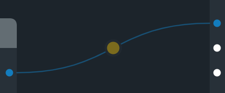
Kelp marks wires with different colors depending on the wire state:
-
A gray wire didn't transfer a single event.
-
A blue wire transferred at least one event.
-
A green wire is the wire the event listener listens to.
-
A pink wire is as q-wire.
-
A red wire transferred an error signal.
Tip: An error signal can go through the components and wires of the dataflow graph and color wires in red. In this case, we recommend that you locate the wire that was first to transfer the error signal. To locate the first red wire, go upstream of your app data flow.
The Port component
Apart from usual ports built in components, Kelp also supports standalone ports, which can be placed outside of components.
This standalone port is also a component called Port. It does nothing to the events passing by. But it's convenient to organize the wires and the canvas.
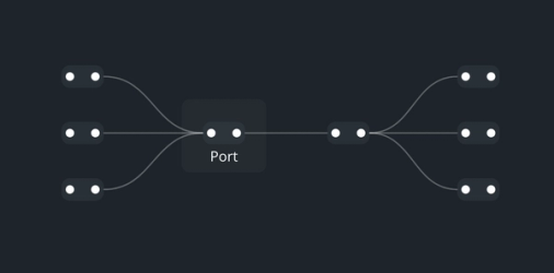
You can place the Port component in two ways:
- Together with a wire. To do so, drag a wire from a port and drop it anywhere on the canvas.
- Via the component library. Look it up in the library and place it as any other component.
Searching for a component
As your dataflow graph will grow, you'll have more components. Use search to locate the components on the canvas faster. Search can find both core components and components inside groups.
You can search by the component name or type.
To do so, click the  icon, type the name or type of the component you're looking for, and press
 Enter.
Kelp will move the canvas and zoom in on the component.
Tip: To open the search bar, you can also use the Ctrl+/ hotkey.
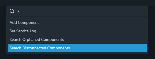
Search can also find the following:
- Disconnected components. They are components that aren't connected to other components.
- Orphaned components. They are non-widget components whose out-ports aren't connected to other components. We single out orphaned components because they don't provide an output and the data flow there reaches its end.
To search for disconnected or orphaned components, open the search bar, type /, and select "Search Disconnected Components" or "Search Orphaned Components".
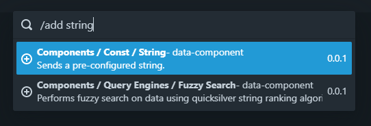
Apart from searching for components, you can use search to place components without reaching out to the component library.
To place a component using search, open the search bar, type /, select "Add Component", type the component you want to place (for example, "string"), and select the found result. Kelp will place the selected component on the canvas.
Grouping components and wires
To tidy up the graph, you can group components. Component grouping is also necessary for creating a composite component, which you can use in other apps.
To group a component:
-
Press and hold
Shift. -
Left click and circle around the components you want to group.
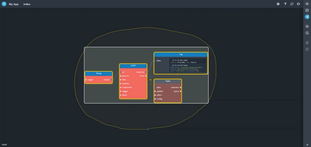
-
Right click on the selected area and, in the context menu, click Group.
Kelp will create a group of components with the default name you can change later.
To see the components a group consists of, you can drill down inside the group. You can do so in two ways:
- Double left click on the group.
- Right click on the group and click Drill down.
You'll drill down to the group level. To return to the previous level of the graph, in the bottom left corner of the screen, click root.
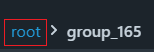
If you no longer need the group, right-click on the group and click Ungroup.
Refreshing your appp
To refresh your app, in the top right corner of the screen, click the  icon.
icon.
Refresh reinitializes all the components and the components re-emit all the events.
Debugging tools
The main debugging tool in Kelp is the event listener.
The event listener is a panel that displays all the data events and signals passing through the selected wires.
To open the event listener, on the Dev Toolbar, click the  icon.
icon.
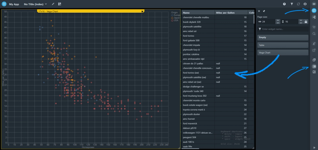
Creating your app layout
Once your app is ready, you can present it to your users.
On the Dev Toolbar, click the  icon. You've entered Design mode.
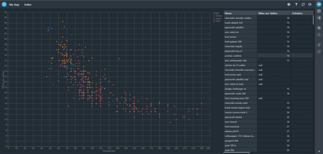
In Design mode, you work with widgets. Widgets are components that display information to your users and form your app layout: charts, tables, lists, forms, diagrams, and so on.
To see all widgets you placed in Developer mode, open the Widget panel.
To do so, press the space bar or, on the Dev Toolbar, click the  icon.
icon.
Drag and drop widgets to the canvas. Arrange and format them to make your app visually appealing.
Previewing your app
You've created your app layout. To make sure that all widgets are in place and correctly formatted, use Preview mode. Preview mode will show you how users see your app.
To enter Preview mode, on the Dev Toolbar, click the  icon.
icon.