Designing Layout
Kelp provides two types of layout editors to design your app’s user interface (UI): Grid Layout and Flex Layout. These visual editors allow you to arrange widgets and elements in an intuitive way.
Grid layout editor
The Grid Layout Editor is perfect for building simple, dashboard-like interfaces. It uses a grid system to position widgets, making it easy to create aesthetically pleasing layouts.
Creating a new view with Grid layout
When you create a new app, a view with the Grid layout is automatically generated and named index by default. You can add more views and even use different layout types in one application.
- Switch to the Views & Layouts panel using the left toolbar.
- Click the dropdown next to the “+ Grid/Flex” button and select “Grid layout” to add a new view with Grid layout.
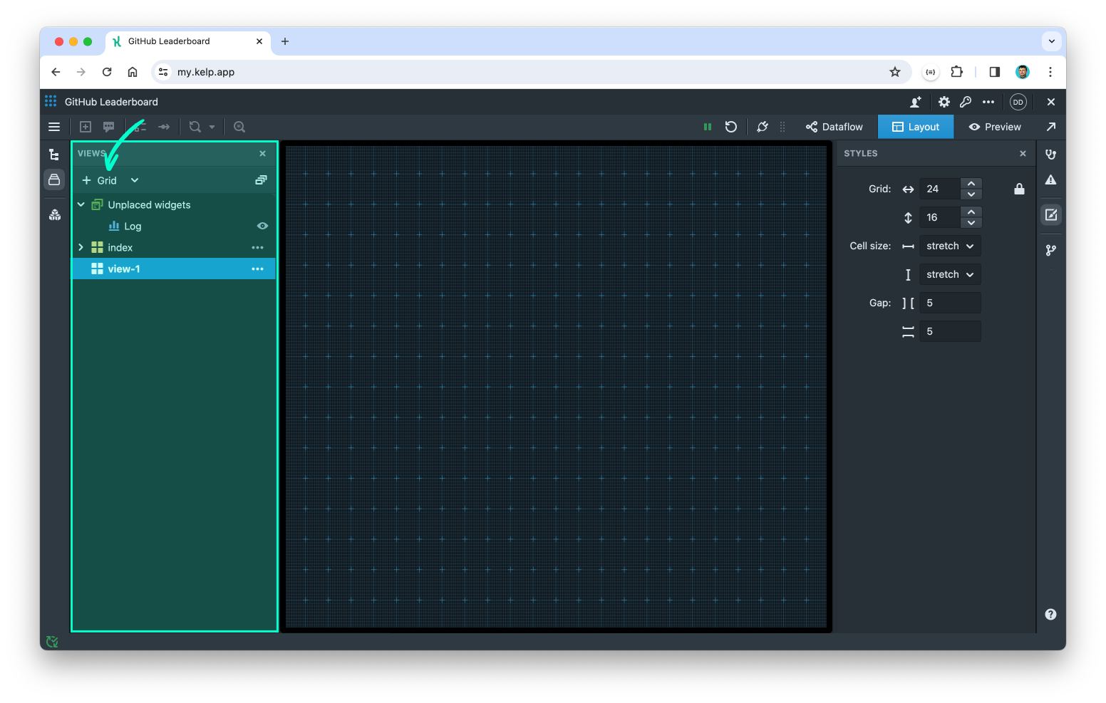
- The new view is automatically named "view-1". You can rename it at any time by clicking the "..." (View options) button next to the view name.
- Now, you should be able to see a grid with blue ruler lines.
Configuring the grid
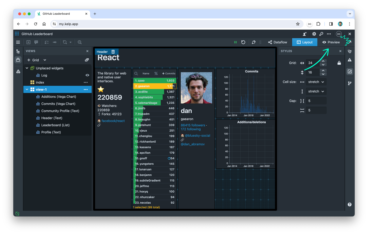
- By default, the Grid layout has 24 columns and 16 rows. To change this, adjust the Grid setting in the Styles panel on the right.
- You can set the Cell size to
stretched(default) to make cells fill the browser window, or choose afixedsize in pixels. - Adjust the gap between cells using the Gap setting.
Adding and positioning widgets
Widgets defined on the Dataflow canvas, but not yet placed on any view, appear under the "Unplaced widgets" folder in the Views & Layouts panel. Once they are placed on a view, they appear under their respective view folder.
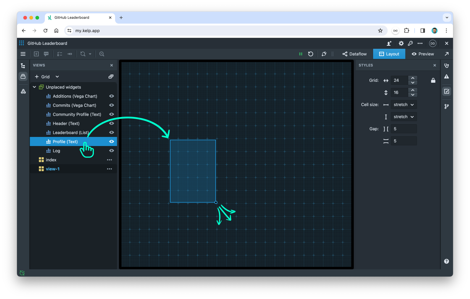
- Drag and drop widgets from the Views & Layouts panel onto the grid to position them.
- To resize a widget, drag its bottom-right corner.
- To reposition it, drag it across the grid.
Note: While designing the app in Layout mode, the app continues to run and widgets may update their contents. However, you cannot interact with the widgets. Use Preview mode to view the fully functional app.
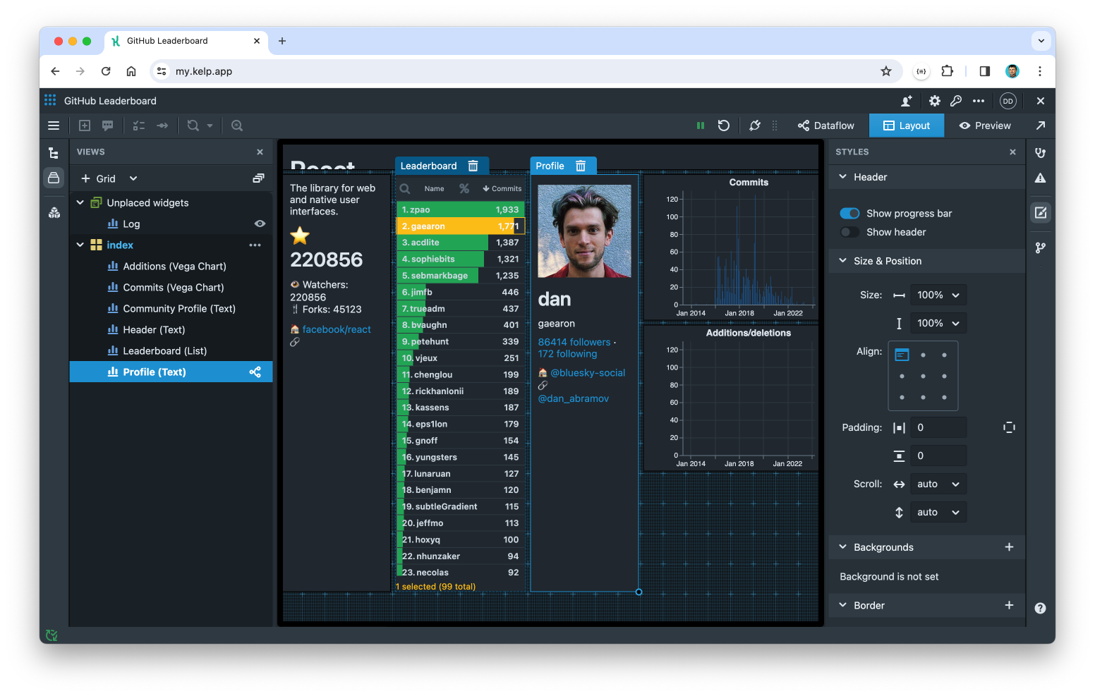
Adjusting widget styles
For every widget you have the ability to show or hide the widget header, adjust the position of the content, add backgrounds or borders, and apply effects such as border radius or shadows.
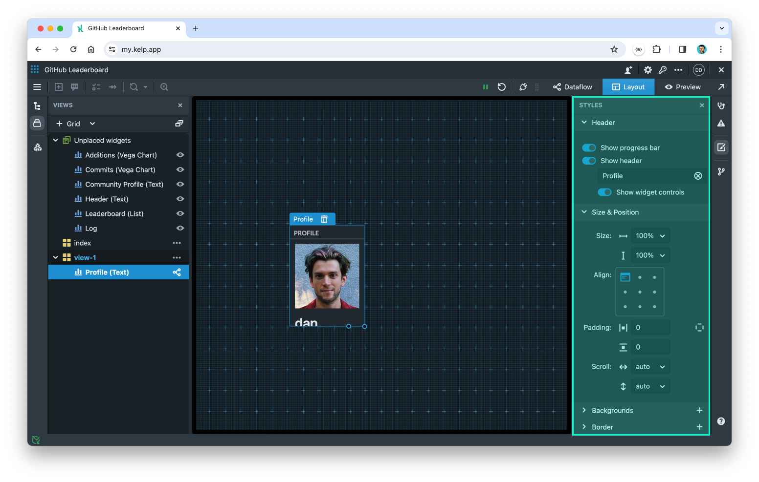
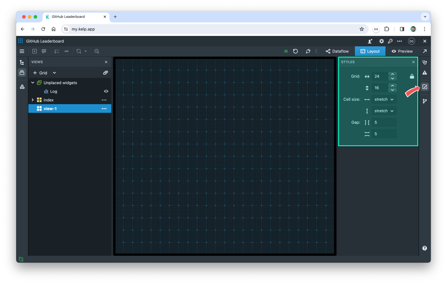
- Select a widget on the grid to activate its Styles panel.
- Adjust style properties as needed. You can see the results on the layout immediately.
Previewing the app
To preview and test your app:
- Switch to Preview mode in the top-right corner to see your app as users would.
- Return to Layout mode to make further adjustments.
Flex layout editor
The Flex Layout Editor utilizes the CSS Flexbox layout model. This provides an efficient method for arranging, aligning, and distributing space among elements on the layout. Using Flex layout, you can create flexible, responsive designs that easily adapt to various screen sizes and device orientations.
Creating a new view with Flex layout
- Switch to the Views & Layouts panel using the left toolbar.
- Click the dropdown next to the “+ Grid/Flex” button and select “Flex layout” to add a new Flex view.
Adding widgets and containers
In Flex layout, you place widgets inside containers on the layout canvas. Follow these steps to add widgets:
- Go to Views & Layouts panel.
- Drag and drop the desired widget from the folder onto the layout canvas. Alternatively, you can drag a container icon and drop it on the layout to create a new container first.
- The hierarchy of containers will be displayed in the Layers panel, located just under the main Views panel.
- As you drag a widget or container over the layout, a green line will indicate where the item will be placed once you drop it.
- There are two ways to rearrange widgets and containers: either drag and drop them into another container on the layout, or rearrange them in the Layers panel.
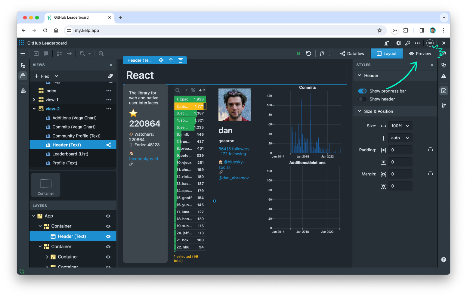
Adjusting styles
- Select a widget or container to activate its Styles panel.
- For containers, you can adjust size, layout type, alignment, padding, margins, backgrounds, borders, and effects.
- For widgets, you have the ability to show or hide the header and adjust positioning. However, you can’t set backgrounds or borders directly at this moment. These should be set on the containing element instead.
Previewing the app
To preview and test your app:
- Switch to Preview mode in the top-right corner to see your app as users would.
- Return to Layout mode to make further adjustments.
Adding more views
You can add multiple views to your Kelp app, similar to adding pages on a website. Each view has a unique slug (ID used in the URL) and an optional title displayed in the app’s topbar.
- Click the “+ Grid/Flex” button to add a view with the desired layout.
- To edit the slug or title, click the “…” (View options) button next to the view name, or click “Organize views” button to manage all views at once.
- In the "Organize views" popover, you can rearrange the order of views by dragging them. The first view in the list will be displayed by default when you open the app.